Add your promotional text...
Designed at OCAD for a Editorial Design class
Beauty Brochure
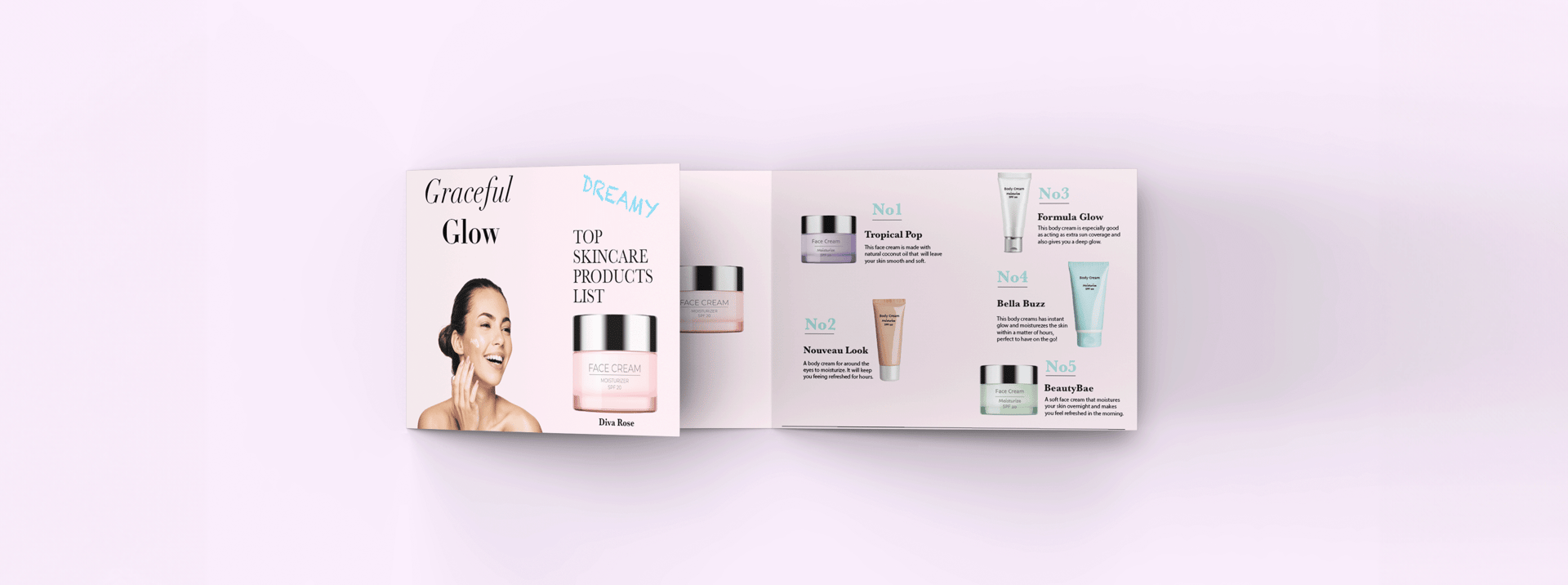
Each product description is clear and concise, highlighting key features that help customers make informed choices based on their skincare needs.This design aligns with typical skincare branding by emphasizing purity, effectiveness, and luxury. By combining these elements, the brochure not only looks visually appealing but also effectively communicates product benefits, attracting customers and reinforcing the brand’s message.
Designed as a mock beauty brochure for my OCAD Editorial Design class, I chose pastel colors for their softness, tranquility, and cleanliness—qualities that resonate well with skincare and beauty products. The clean, organized layout ensures easy access to information without overwhelming the reader, allowing products to stand out without distractions.
For visual hierarchy, I used headings like "Graceful Glow" and subheadings such as "TOP SKINCARE PRODUCTS LIST" to guide attention, while numbering products (No1, No2, No3, etc.) creates structure and professionalism. I included product images to offer a visual reference, with a model applying face cream to add a relatable, aspirational element. For typography, I selected clean, readable fonts, with a contrast between larger headings and smaller product descriptions to aid navigation. The use of a handwritten style for the word "DREAMY" adds a personal and friendly touch to the brochure, making it feel more approachable and less formal.