Add your promotional text...
Designed at OCAD for a Color Theory Class
St. Henri Donuts Bakery

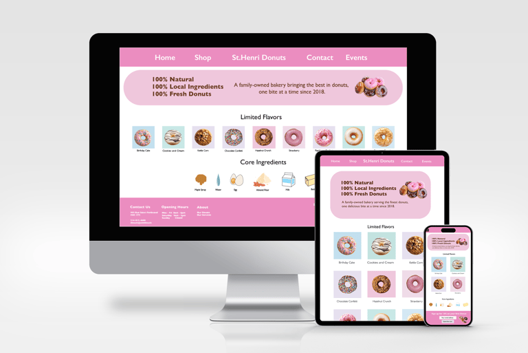
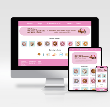
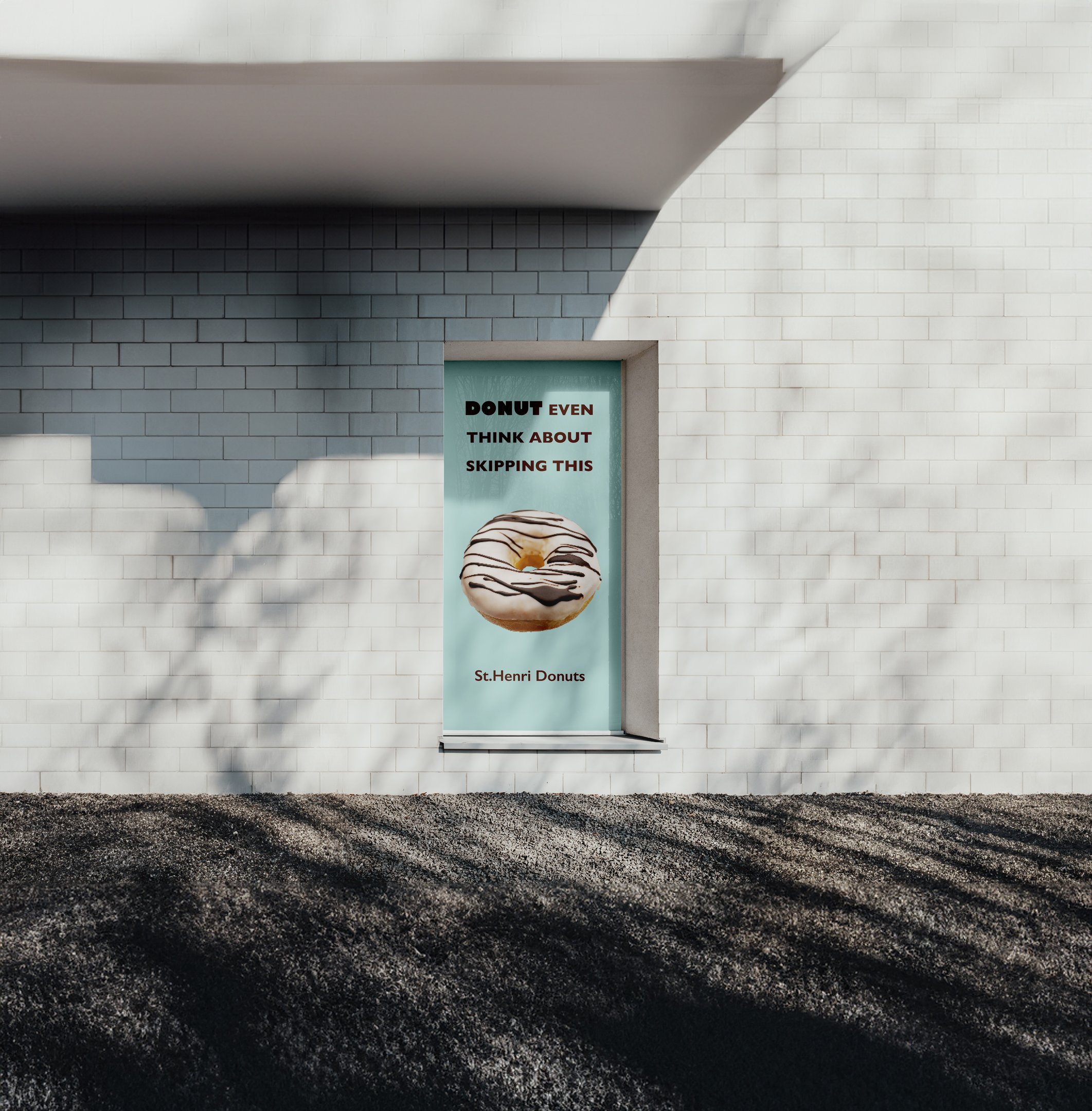
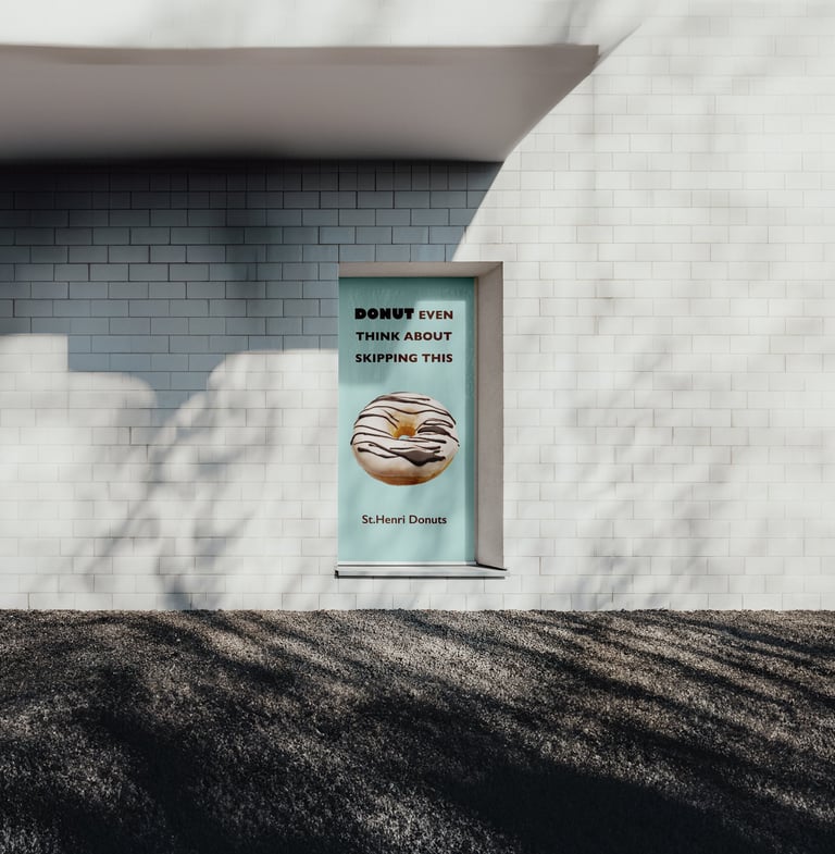
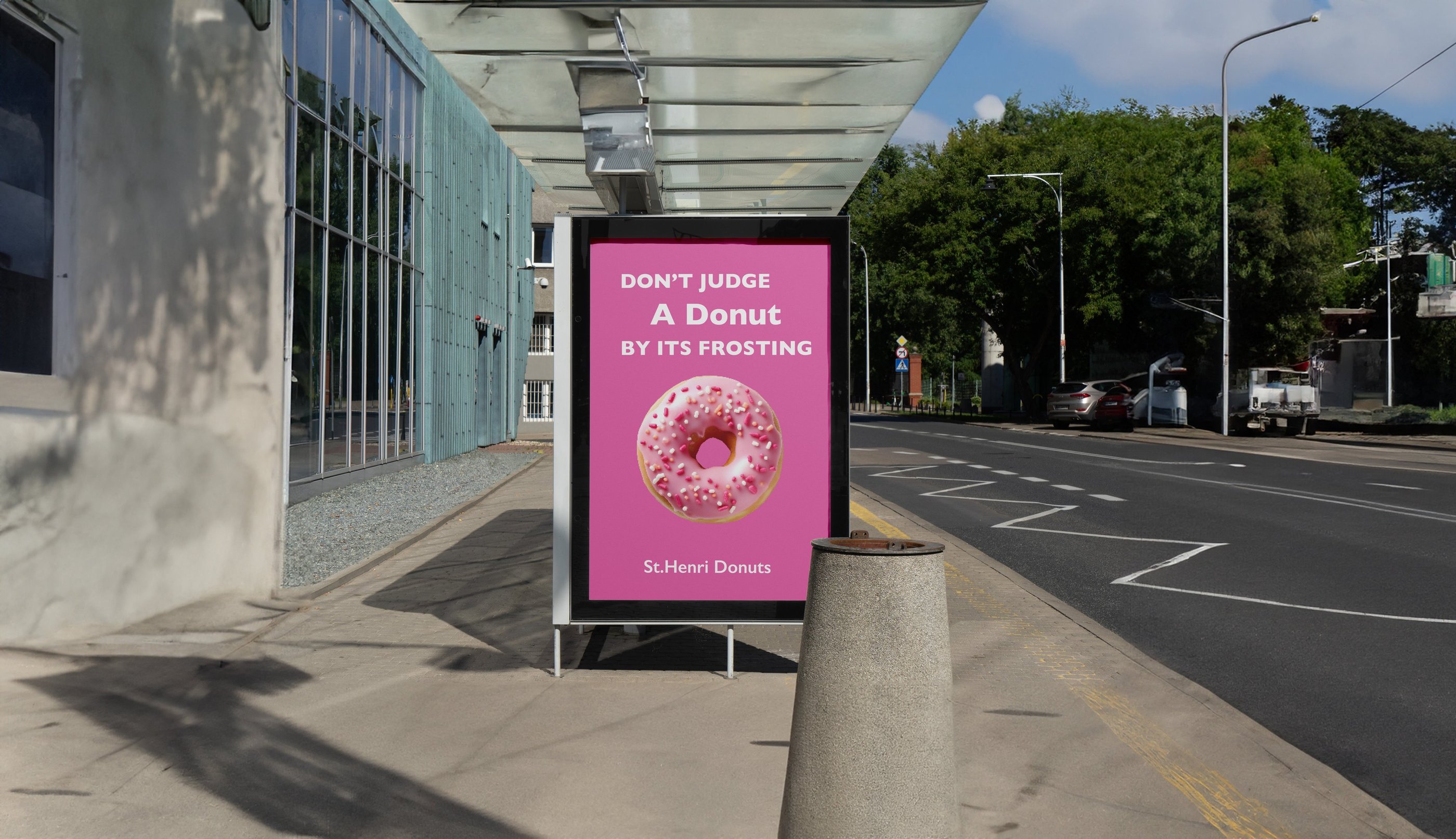
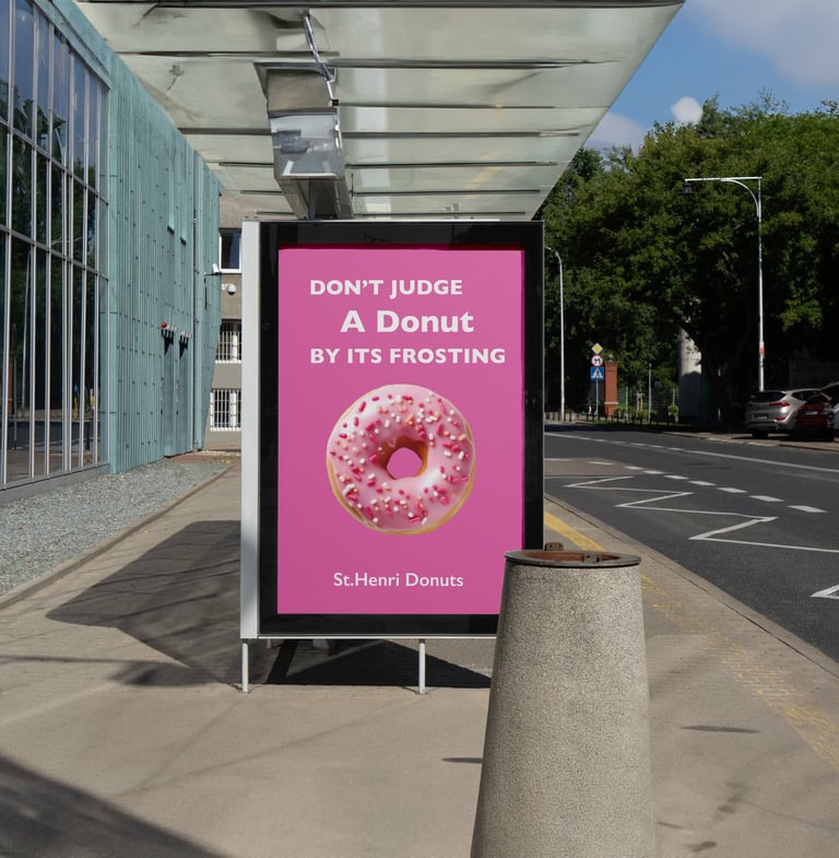
For my final color theory project, I designed a website template for a family-owned dessert business in St. Henri, Montreal, specializing in donuts. Using a square-based layout to highlight the desserts, I chose a pastel palette—lavender, light blue, pink, green, and white—to create a welcoming, calming atmosphere. Inspired by the bakery’s local charm, I started with adjectives like kind, calm, happy, and hungry to define the mood, linking each feeling to a color. I refined my design through research, mood boards, and wireframes, ensuring it resonated with the target audience—local young professionals, families, and older residents.
